Choosing Colors for Your Next Painting Project – Part 2: The Interior Design Rule

 The next step after learning how to match and select colors is how to introduce those colors into a space. In part two of our blog series, Choosing Colors for Your Next Painting Project, we discuss the interior design rule focused on implementing colors to help with your home decorating.
Various ways of distributing colors exist and much of that depends on the look you’re trying to achieve in a room. For a nuanced, sophisticated, or vibrant look, home decorators tend to have a larger list of colors. However, without the right structure, a room of many colors risks looking busy or disconnected. Simple color schemes can tame an environment. Rooms are made calm and controlled with as few as two color options, but be aware that such a palette may look dull with uninteresting accents. The smart way to go is to follow the 60-30-10 rule of interior design.
The 60-30-10 Rule
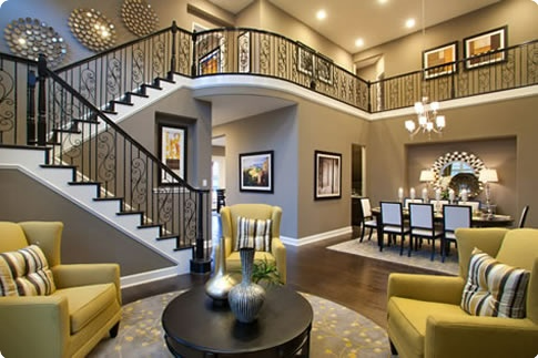
Design experts say three is generally the right number of colors for the perfect palette, ensuring the best repetition and contrast in a scheme. The 60-30-10 rule balances a design composition by allowing natural shades to establish the foundation of a room’s design and giving bold colors a chance to pop and complete the look.
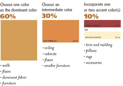
This rule works as follows: choose three harmonious colors, then divide the distribution of those colors by 60-30-10: 60% dominant, 30% secondary, and 10% accent. See an example of how the distribution works below:

The Dominant Color
A hue coating 60 percent of a space is best chosen as a low intensity color, usually a neutral, that provides the foundation of a color composition. Employing the strongest or brightest colors in your palette as the dominant color can be off-putting and distract from the secondary and accent colors made to complete the design. Placing the dominant color on a room’s walls and ceiling is a great way to establish the foundation of a look and give the other colors a chance to shine.

The Secondary Color
The hue covering 30 percent of a space plays the role of a balance between the neutral dominant color and the rich accent color. Its level of intensity is meant to be stronger than the dominant color, but weaker than the accent color. Think of the secondary color as the bridge between two ends of the spectrum comprised of your color palette. This color is works as the furniture or cabinetry in a room.

The Accent Color
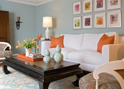
The remaining 10 percent of a room will be occupied by an accent color. The chosen color works best if it is able to hold equal rank with the other colors occupying more space. The accent color should therefore be a bold and rich choice, perhaps restricted to a room’s accessories, such as pillows, vases, rugs, and towels.

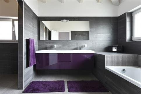
Remember, the 60-30-10 rule isn’t necessarily the right way to design, nor the only way. The 60-30-10 rule is an easy, accessible guideline for home decorating. Simple schemes composed of monochromatic schemes or with only two colors look great in bathrooms and other small spaces. Other design choices may allot hues differently or feature more than three colors. Don’t be afraid to try new ways of interpreting color to fit your home.
For more information on choosing colors for your next project, use the categories of the color wheel to determine what colors can help you get the desired feel in a room in Choosing Colors for Your Next Painting Project – Part 1: The Color Wheel. Once you’ve finally chosen your colors, check off your personal design list with Choosing Colors for Your Next Painting Project – Part 3: Home Decorator’s Checklist.
This series of posts is meant to guide one to learning how to choose good colors. Spaces and tastes vary, however, and creating a new color scheme can be a difficult and time-consuming task. We recommend hiring a professional color consultant to help you pick the right colors.
Editor’s Note: This post was originally published in September 2013 and has been updated to improve content for our readers.
 Click to call


